On my last post I talked about abrupt logo changes in design, specifically Instagram, and how that helped to promote a new persona for the brand. That modern and serious twist is something that we’ve seen happening more and more often this past decade.
Even though not being the most simplistic of the examples, Instagram’s redesign followed a slow trend of flat logos and logotypes that might be referenced as the “2010s style” in the future. The trend is opposed to previous work made in the early 2000s, when everything online was shiny and brand-new and all the tools available should be used at once in order to display how advanced technology was. I’m talking gradients, shadowing, glow, details, and life-like mascots. As time passed by and the Internet stopped being such a chaotic place, designers were able to tone down their work and eventually all the previous work from the last decade was seen as tacky and busy.
Windows might be the best example of how this sudden peak in technology changed logo design and determined a remarkable style for a short period of time. The image bellow shows how Windows has updated its logos along the years to fit the technology and style at the time they were created:
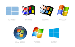
It’s interesting to notice how the first logo and the most recent one are mainly the same concept, while 2001 to 2009 are different adaptations of the same storyline.