
For Easter, I’m going to eat Peeps, drink Peepsi and cry myself to sleep.
Month: March 2023
Can’t Read My Poker…Profile Pic? NFTs Give Gambling a Go
I’m not a gambler myself, as I’ve had many bad luck moments and I’d rather just not get my money involved in it if I have the choice. It came as a surprise when I found out that NFTs have taken a new step into money-spending: online casinos. I guess there’s something for everybody, right?
NFTs actually can promote gambling in various ways. Online casinos, for instance, promote games on the result of an NFT match. NFTs are also used as rewards for players, sell merch, etc. Apparently it’s a thing.
Jetpack Repeat Visitors
Thank you for visiting my website! I hope you enjoy the content I’ve prepared for you.
Jetpack Gallery


File Block
I wonder if I can make the File Block work… Let’s figure it out:
Just Something to Listen to
Videos About Logos
Here are some interesting resources about logos. Hope y’all enjoy it!
A Final Word About Minimalist Logos
I’ve been rambling about this topic for a while, but this post will be my final word – for now. I’ve made it very clear that I’m in favor of minimalist logos in my past posts. I like how they can be simple and practical and easily recognizable.
That being said, I believe that the most interesting thing about design is that there’s no blueprint and you can always be creative. Design rules are often broken – and can work really well!
Sometimes being minimalist just doesn’t work for the kind of project you’re working on, or maybe there’s not even a reason to follow a simpler approach. It all comes to having a good idea ![]() . Grab it before it vanishes away!
. Grab it before it vanishes away!

Minimalist Logos (or A Short Title to Match the New Design Trend While Annoyingly Using Parenthesis to Make the Title Longer Than Necessary)
I’ll be honest: I’m a fan of minimalist movement in design as much as I’m a sucker for negative space, which is a lot. Shoot me. But, as a Designer, I have to consider the viability of reproducing logos in multiple sizes, materials, and conditions, while also being time efficient and creating something that looks unique for the client.
The realistic feeling of older maximalist, detailed logos can be eye-catching and fun when on a website, but work terribly if not printed in the most favorable conditions and are hard to break down into simple and recognizable color palette and shapes.
Most efficient logos have easily recognizable shapes, are descrpitive of what the company does or the company’s name, and are easy to reproduce in different sizes without losing details.
I think that we have a hard time saying goodbye to maximalist logos because they’re the last grasp we have of the 2000s, a time when technology felt promising and we weren’t doomed to run around looking for outlets to charge our smartphones. But, as much as people will complain, it is time to move on and embrace new trends – we already do it with TikTok, why not with logos as well?
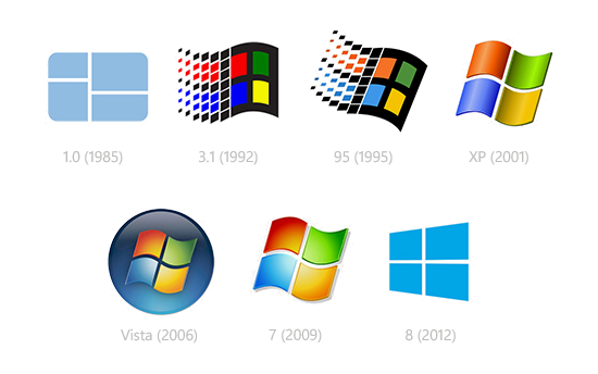
Windows and the 2000s Logo Design
On my last post I talked about abrupt logo changes in design, specifically Instagram, and how that helped to promote a new persona for the brand. That modern and serious twist is something that we’ve seen happening more and more often this past decade.
Even though not being the most simplistic of the examples, Instagram’s redesign followed a slow trend of flat logos and logotypes that might be referenced as the “2010s style” in the future. The trend is opposed to previous work made in the early 2000s, when everything online was shiny and brand-new and all the tools available should be used at once in order to display how advanced technology was. I’m talking gradients, shadowing, glow, details, and life-like mascots. As time passed by and the Internet stopped being such a chaotic place, designers were able to tone down their work and eventually all the previous work from the last decade was seen as tacky and busy.
Windows might be the best example of how this sudden peak in technology changed logo design and determined a remarkable style for a short period of time. The image bellow shows how Windows has updated its logos along the years to fit the technology and style at the time they were created:
It’s interesting to notice how the first logo and the most recent one are mainly the same concept, while 2001 to 2009 are different adaptations of the same storyline.