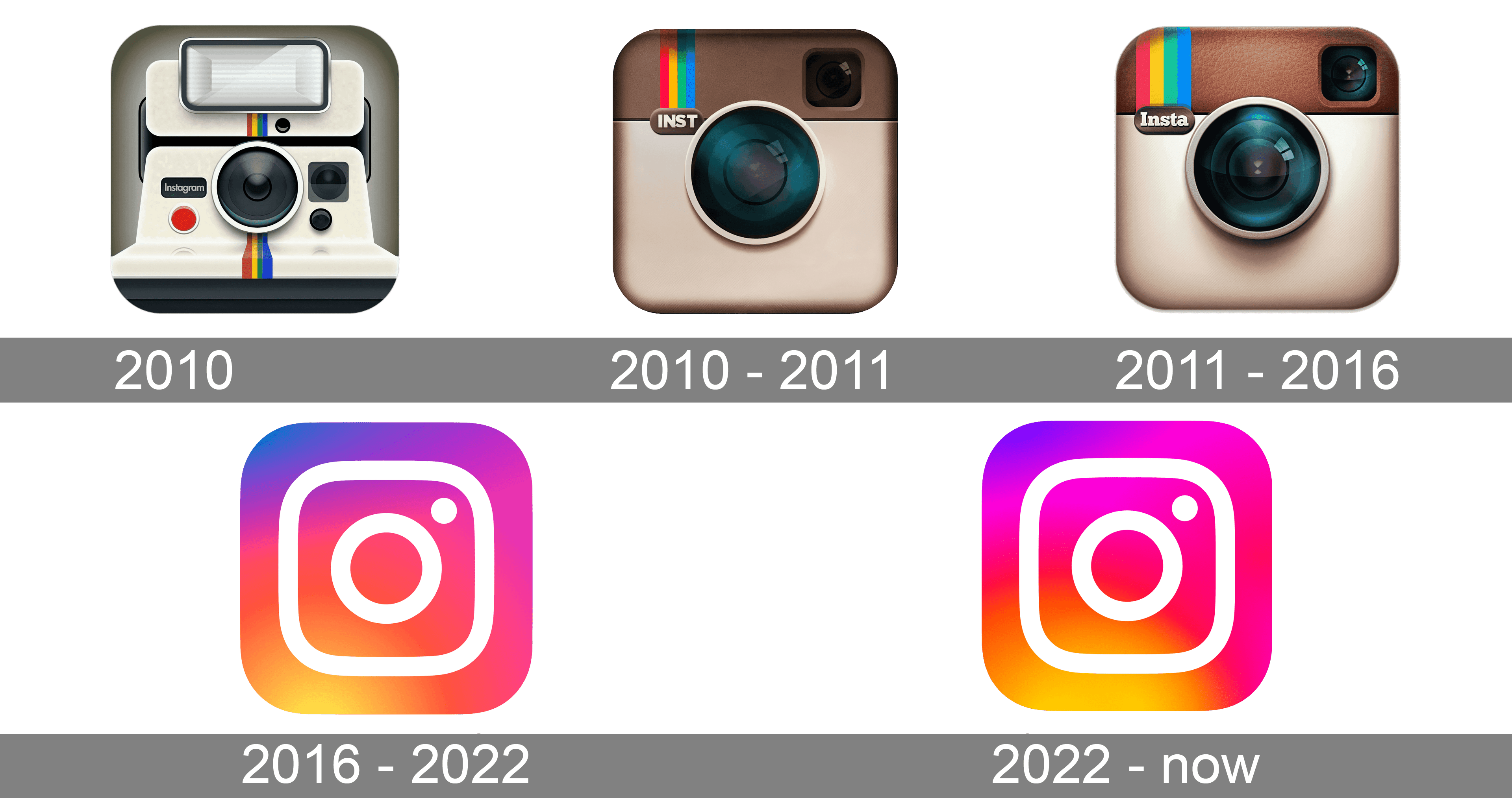
Everyone in their lifetime has probably experienced a logo redesign that sparked feelings of hatred or disgust – it’s just one of the many powers of design. Mine was Instagram’s leap from its iconic brown instant camera to the colored glossy square with a circle in the middle, a redesign that happened in 2016. In some way, the brand grew popularity while being identified by its unique and surprisingly detailed logo that also referenced polaroid cameras (extremely romanticized by Tumblr back then).
As much as I was initially overwhelmed by the rebranding, I got used to it and the message it carried along: Instagram had consolidated itself as a strong social media platform that was here to stay.

Brands are like people – they have a voice, a purpose, and memories that you relate to them, and, just like people, they change. Instagram begun as an image sharing social platform (something that Jamie Lee Curtis had in mind for years) that took blogging into a different turn, but wasn’t able to sustain itself with just pictures. Not to back-in-my-old-day this, but when I joined the platform in 2012 (!), all pictures had to be in square dimentions, no videos were allowed, and only one picture per post was support.
And look at Instagram now!
People have literally built careers just by using the platform the right way. This change from being a cool teenage-eganging social media network into its professional self had to be represented in all aspects of the brand – including its logo.
