I’ll be honest: I’m a fan of minimalist movement in design as much as I’m a sucker for negative space, which is a lot. Shoot me. But, as a Designer, I have to consider the viability of reproducing logos in multiple sizes, materials, and conditions, while also being time efficient and creating something that looks unique for the client.
The realistic feeling of older maximalist, detailed logos can be eye-catching and fun when on a website, but work terribly if not printed in the most favorable conditions and are hard to break down into simple and recognizable color palette and shapes.
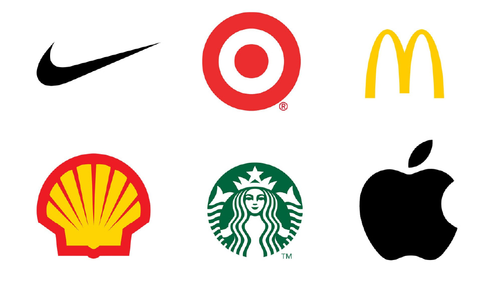
Most efficient logos have easily recognizable shapes, are descrpitive of what the company does or the company’s name, and are easy to reproduce in different sizes without losing details.
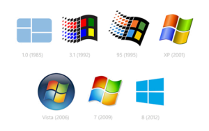
I think that we have a hard time saying goodbye to maximalist logos because they’re the last grasp we have of the 2000s, a time when technology felt promising and we weren’t doomed to run around looking for outlets to charge our smartphones. But, as much as people will complain, it is time to move on and embrace new trends – we already do it with TikTok, why not with logos as well?